
Black and White Images With Texture
The Surfaces, Details, and Feel of Monochrome

Shooting in black and white strips a scene down to its essentials. Without color to grab our attention, other things stand out: lines, light, and especially texture. Texture is what makes a photograph feel touchable. It’s the difference between smooth and rough, delicate and coarse, worn and new.
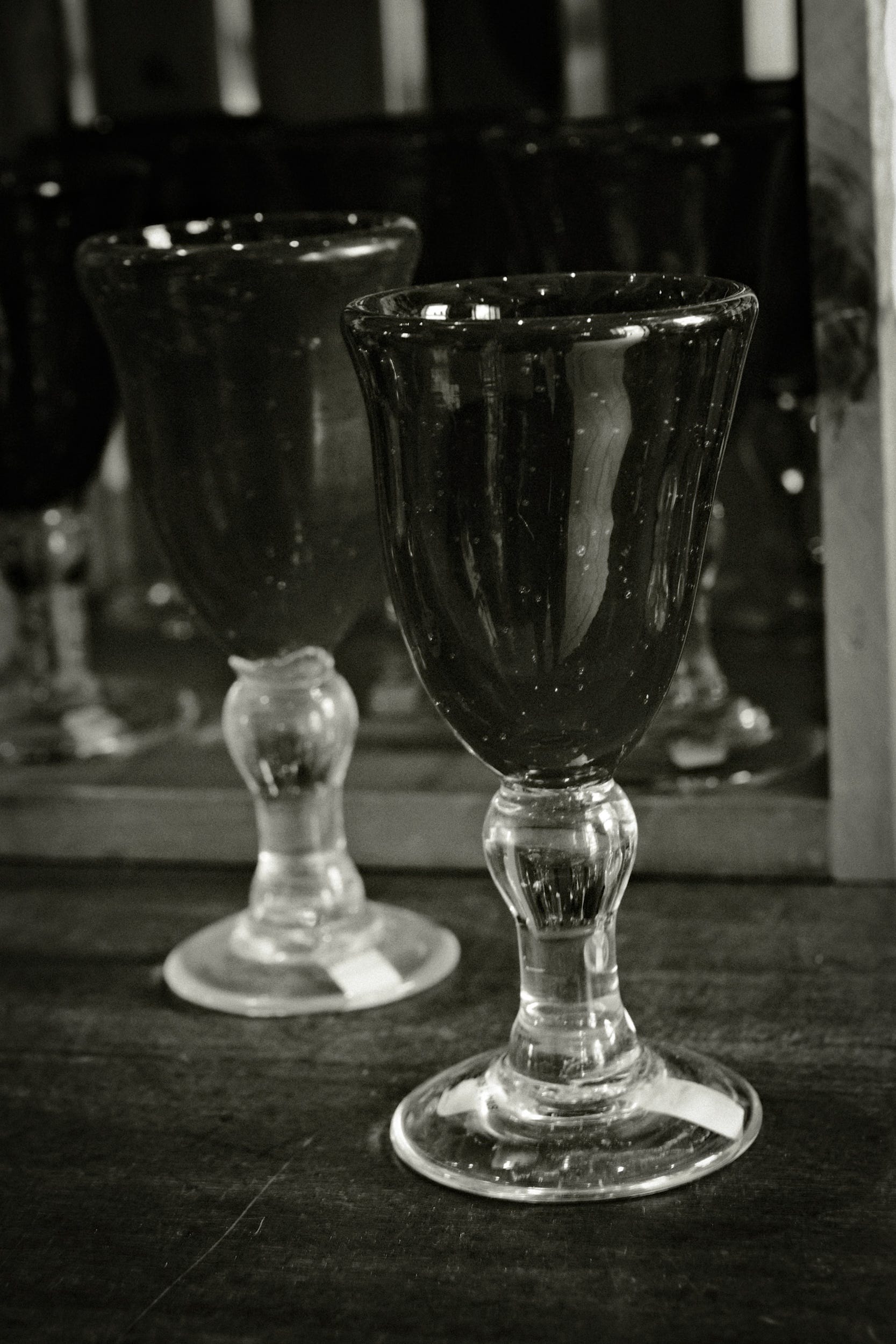
The color and transparency would likely get your attention first in the image of these glass pieces if it were taken in color. In monochrome, the smooth surface stands out more. The reflections of the light and imperfections in the glass show off a subtle texture. You know how it would feel if you touched it. There are hints of how it was made in the slightly uneven surface and the bubbles in the glass.

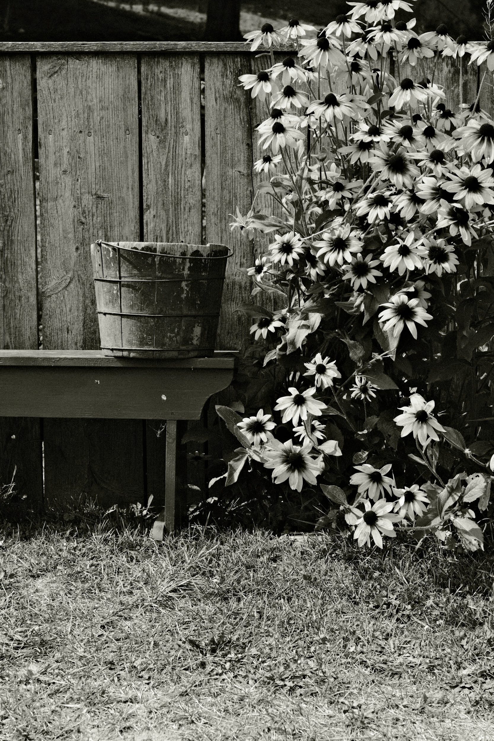
In the following image, monochrome highlights the difference between the wood in the fence and the bucket, and the soft petals of the flowers. In color, the bright flowers would have held the viewer’s attention. In black and white, the eye can take in the variety of textures. The contrast between the wood grain and the soft flower petals adds depth and interest to the image.
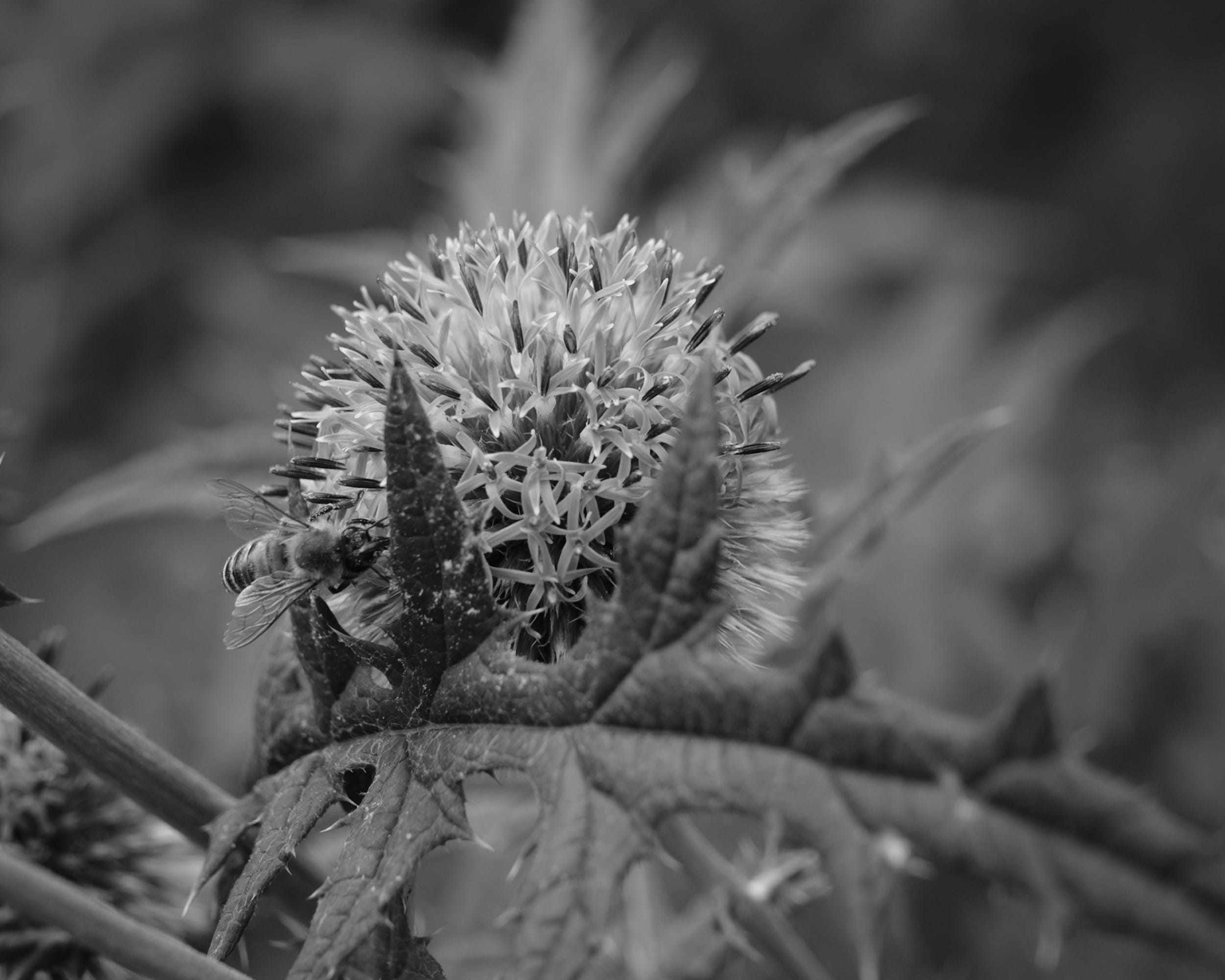
The image of the bee on the thistle is rich in its fine details. The spikes, the leaves, and the fuzz on the bee all stand out without the distraction of color.
Texture is one of my favorite things to look for when I shoot in black and white. And when I am specifically looking for black and white images, I feel that I notice it more. It’s fun to search a location for textures and make compositions around them.
Textures tell the story of wear, of age, and of delicacy. They help the viewer to feel the subject of an image. In black and white, these textures seem to be more obvious and play a more important role in the composition.
Photographing in black and white this month, I’m learning to see not just what things look like, but what they feel like

✅ Where to Find Me
You can find more of my work on the web at: Simmons Photography
If you want to work with me, or inquire about licensing images: Contact Page
More of my work can be seen on Vero and Flickr.
Learning in Monochrome - Digital and Analog

In my last post, I talked about my current personal project. I’m shooting all my personal work in black and white this month. For this Visual Field Notes post, I’m going to talk about some behind-the-scenes info about the camera settings on my digital cameras, and a little background on the film stocks I’m using for my analog work.
In Search of Contrast

If you’re following along, I’m shooting exclusively in black and white this month, trying to get better at composing shots without relying on color. I’ve been looking at images with contrast. Tonal contrast can really impact the mood of an image, but other types of contrast can help add interest and draw the viewer in.
Visual Field Journal: Inside An Old Barn

Looking for interesting subjects for monochrome images, I spent some time inside an old barn on our property to take some shots. Here are a few of the better ones.Thanks for reading Peet Hook Journal! Subscribe for free to receive new posts and support my work.
Why Shapes Matter More When Color Is Gone

As I am working in black and white this month, another element I am looking at much more closely is shape. With color removed from the scene, the eye latches onto edges and outlines, searching for something recognizable: a window, a ladder, a tree. Geometric forms like triangles and rectangles suddenly stand out as the structure of the frame, while repe…
Very interesting, 🙏