
In Search of Contrast
Learning to make better use of contrast in my images

If you’re following along, I’m shooting exclusively in black and white this month, trying to get better at composing shots without relying on color. I’ve been looking at images with contrast. Tonal contrast can really impact the mood of an image, but other types of contrast can help add interest and draw the viewer in.
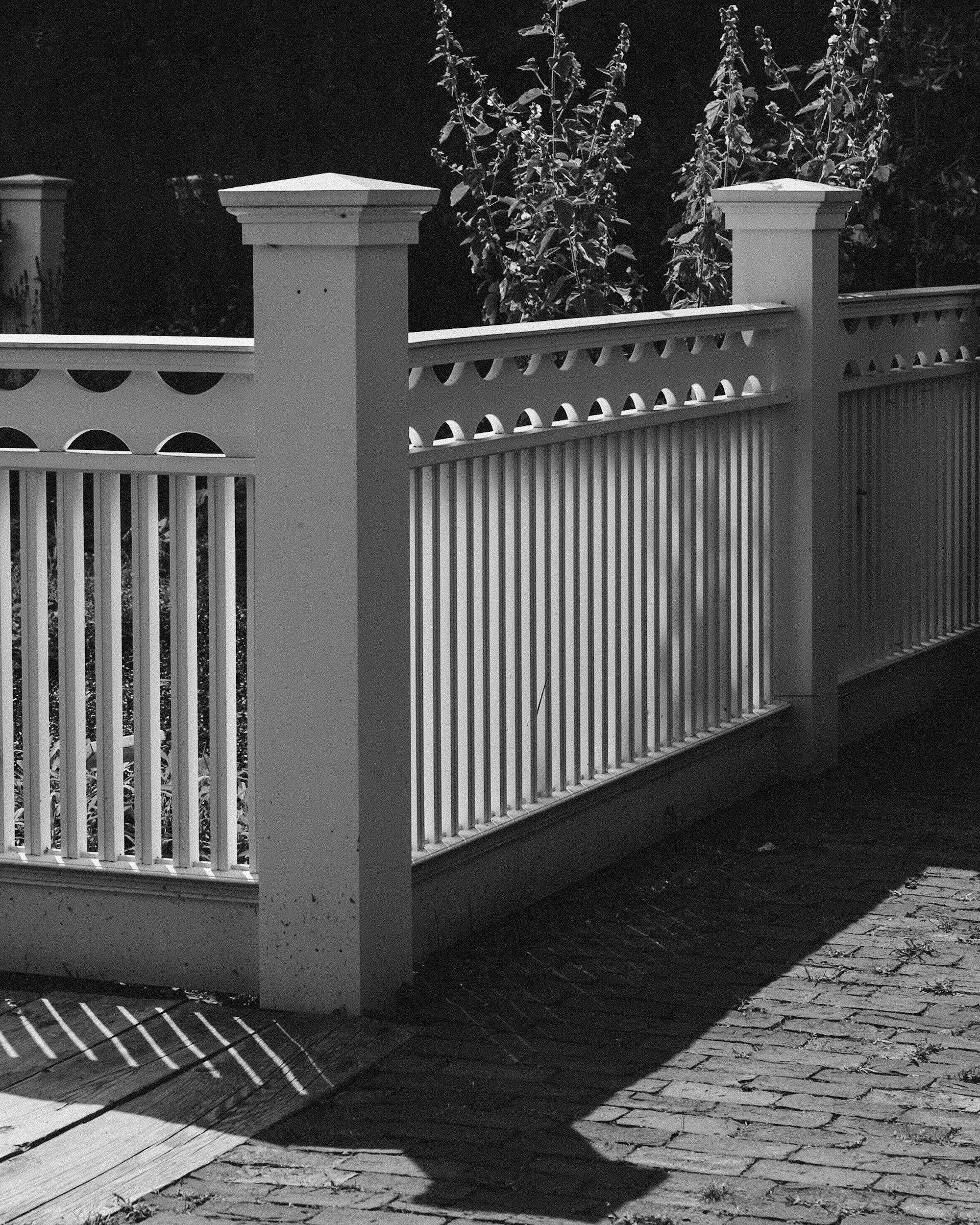
This week I’ve been looking closer at light and how it interacts with different surfaces. This fence created some interesting shadows late in the afternoon. With a strong side light, it became a study in light and dark, and of shapes and shadows. Contrast makes the shape of the fence stand out, as well as casting shadows on the ground, mirroring the shapes of the subject.
What Contrast Does
Contrast is the difference between light and dark, but in monochrome it’s more than a technical setting; it’s a powerful compositional element. It can be:
Tonal – the stark separation between bright whites and deep blacks.
Textural – rough against smooth, soft against hard.
Emotional – stillness in chaos, light in a shadowed place.
Directional – using light to lead the viewer’s eye.
The kind you choose changes the mood of the image. To see this in action, let’s start outdoors.
Subtle vs Bold in Nature
These are two photos I took along the water’s edge in the early morning. One image, taken early with a foggy mist still hanging over the water, has a different feel than one taken later as the sun got higher and the light began to have a little more of an edge to it.
The softer image has a more even lighting and less heavy contrast. Silhouettes are providing some deep black tones in the foreground, but with the lighter cover of grasses and fog behind them, the transition is subtle. This image has an overall feeling of calm about it.
The second image shows the cattails in silhouette, with a very sharp transition between those blacks and the bright sunlight on the water behind them. This creates a bold image that draws the viewer’s eye to it.


Takeaway: In monochrome, the type of contrast you choose shapes the image’s voice. Low contrast invites reflection; high contrast commands attention.
Now, let’s go indoors and see what some window light can do.
Focus and Mood in the Workshop
These two images were taken in the same room, in the same light. But compositional choices give them two distinctly different looks.
The shot with the stool makes use of the shadows below the workbench to add some hard contrast to the scene. Compared to the dark background, the light hitting the top of the stool is like a spotlight, with the softer light falling on the tools in the window adding context to the scene. The focus of the image is immediately drawn to the seat where the textures are front and center, telling the story of years of use.
The mallet on the windowsill does not have as many dark shadows around it to immediately set it apart. The rest of the scene has essentially the same light, and the contrast is more subtle. The lights and darks in the scene highlight the small details, such as the wood grain, and the small strip of paper lying on the surface next to the mallet. This is contrast for mood, letting you slowly discover the small details.


Takeaway: High contrast can announce a subject. Soft contrast can invite you to explore it.
Pulling It Together
Contrast can be more than a choice of how you light a scene. It can be about the way you want the viewer to see, and the story you want to tell. Contrast can also be a volume knob. You can turn it up for a graphic, high-energy frame, or bring it down for a softer, more atmospheric one.
More Than Just Light
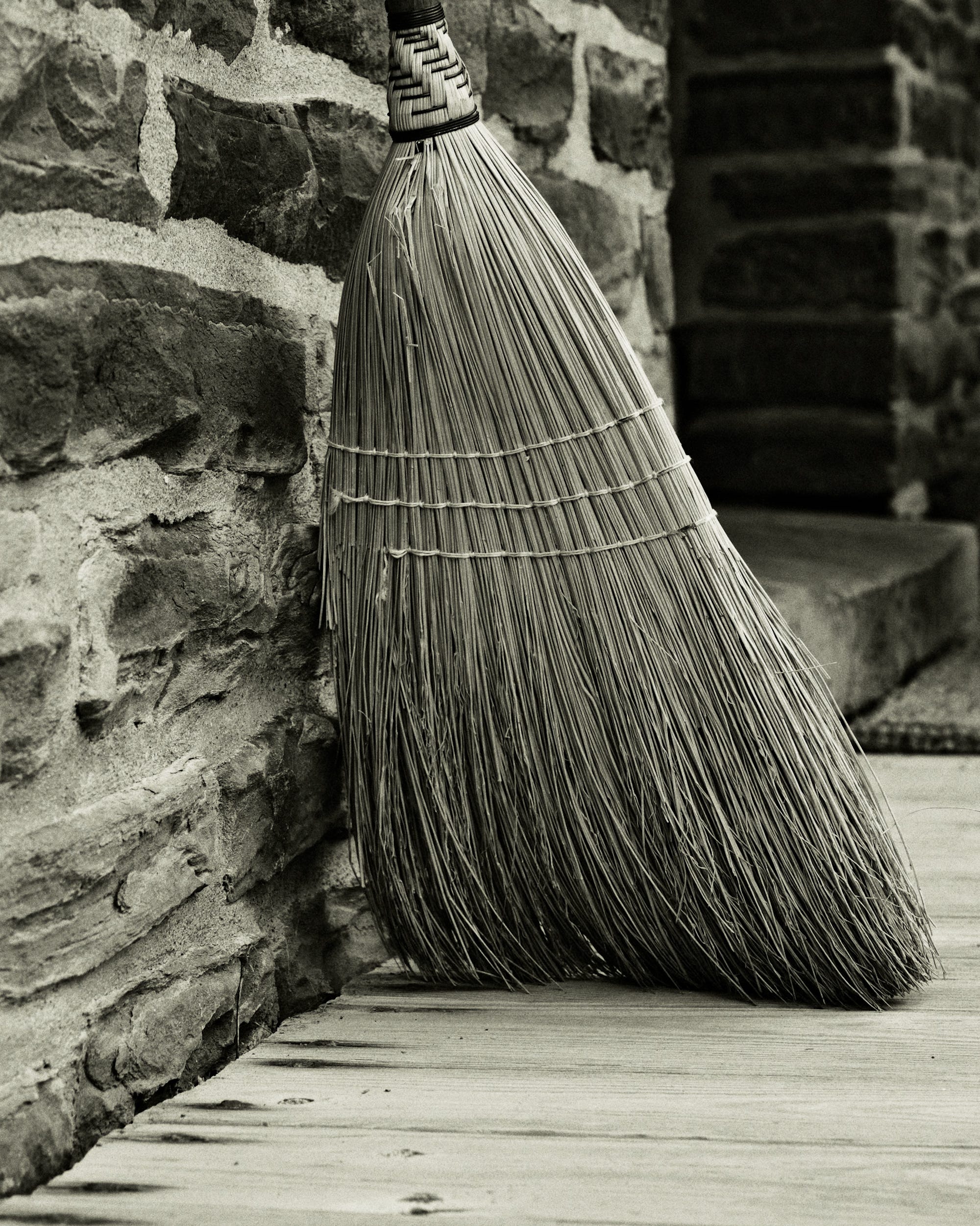
Contrast can be about more than just the light. The contrasting textures in this image, with the rough stone and the smooth floor, make the straight, uniform straw of the broom stand out. This image waits for you to see the contrast.
It’s easier to see these contrasts in black and white images. When I’m thinking about black and white, it’s easier to look for them when composing a shot. I hope that I can train myself to look for this in all of my images, even in color.

✅ Where to Find Me
You can find more of my work on the web at: Simmons Photography
If you want to work with me, or inquire about licensing images: Contact Page
More of my work can be seen on Vero and Flickr.
🎒 The Gear Bag - Gear and Inspiration
Some links in this section are affiliate links. If you make a purchase through them, I may earn a small commission at no extra cost to you. I only share gear and resources I personally use or believe in.
As an Amazon Associate, I earn from qualifying purchases.
What I’m currently reading… David duChemin’s The Heart of the Photograph. David is always a great source of inspiration, and this book is an excellent read.
Fabulous!
Lovely read with great examples & wow —the 1st photo taken along the water’s edge is absolutely outstanding.