
Why Shapes Matter More When Color Is Gone
Working in Black and White – Learning to See in Shapes

As I am working in black and white this month, another element I am looking at much more closely is shape. With color removed from the scene, the eye latches onto edges and outlines, searching for something recognizable: a window, a ladder, a tree. Geometric forms like triangles and rectangles suddenly stand out as the structure of the frame, while repeating lines or patterns create rhythm. Even ordinary objects take on more weight when reduced to silhouette. What once might have been “just a house” or “just a barn” becomes an arrangement of bold forms that carry their own mood and meaning.
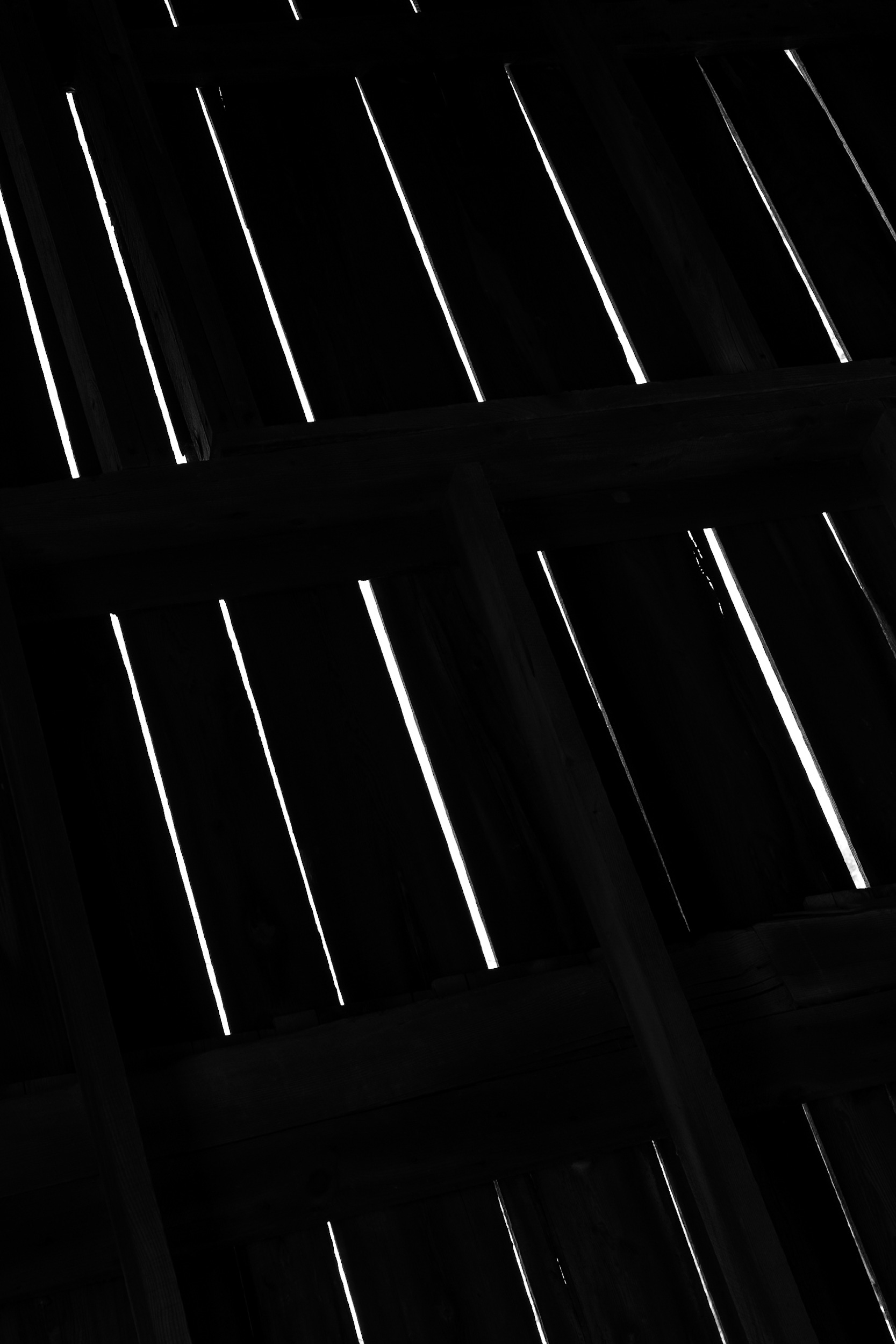
The light leaking through between the boards of this barn creates a repeating pattern, a rhythm. What might be overlooked in color becomes the entire subject in monochrome, like these thin slits of brightness cutting into deep shadow.
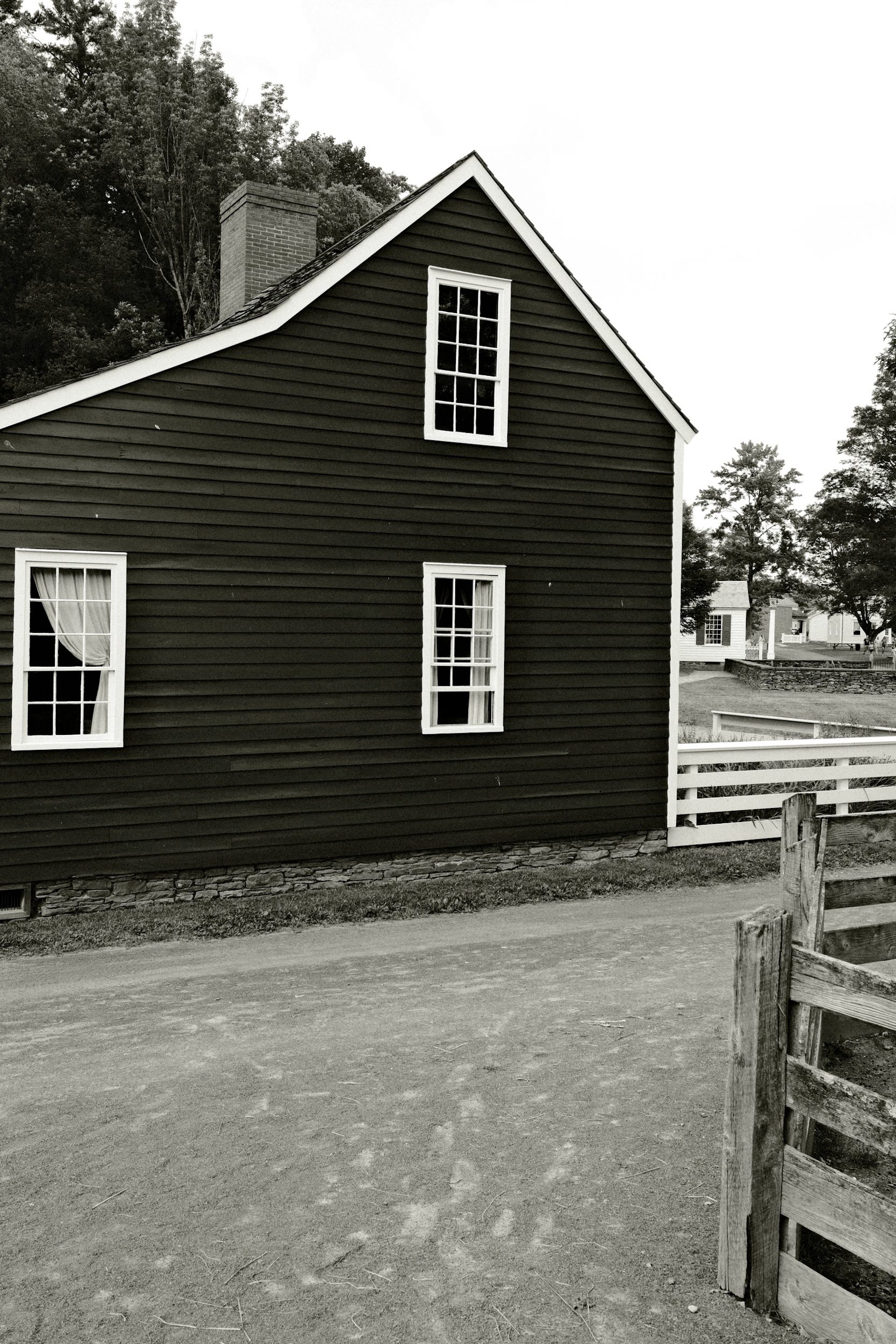
And with the house below, the strong shape of the building against the bright sky is the focal point. Reduced to a simple block of black against white, it feels more like a symbol than a place. Without its deep red color, it’s solid and heavy.
Shapes aren’t always this simple. Some subjects don’t reduce neatly to a block of black or a triangle against the sky. Yet even in more complex scenes, the viewer’s eye is still searching for something familiar to hold onto.
Take the anvil in the image below. Its shape is instantly recognizable. It’s heavy, solid, and unmistakable. Around it are other tools and textures that add context, but it’s the silhouette of the anvil itself that carries the story. Even without color, we know exactly what we’re looking at, and we immediately start connecting it to history, labor, and craft.

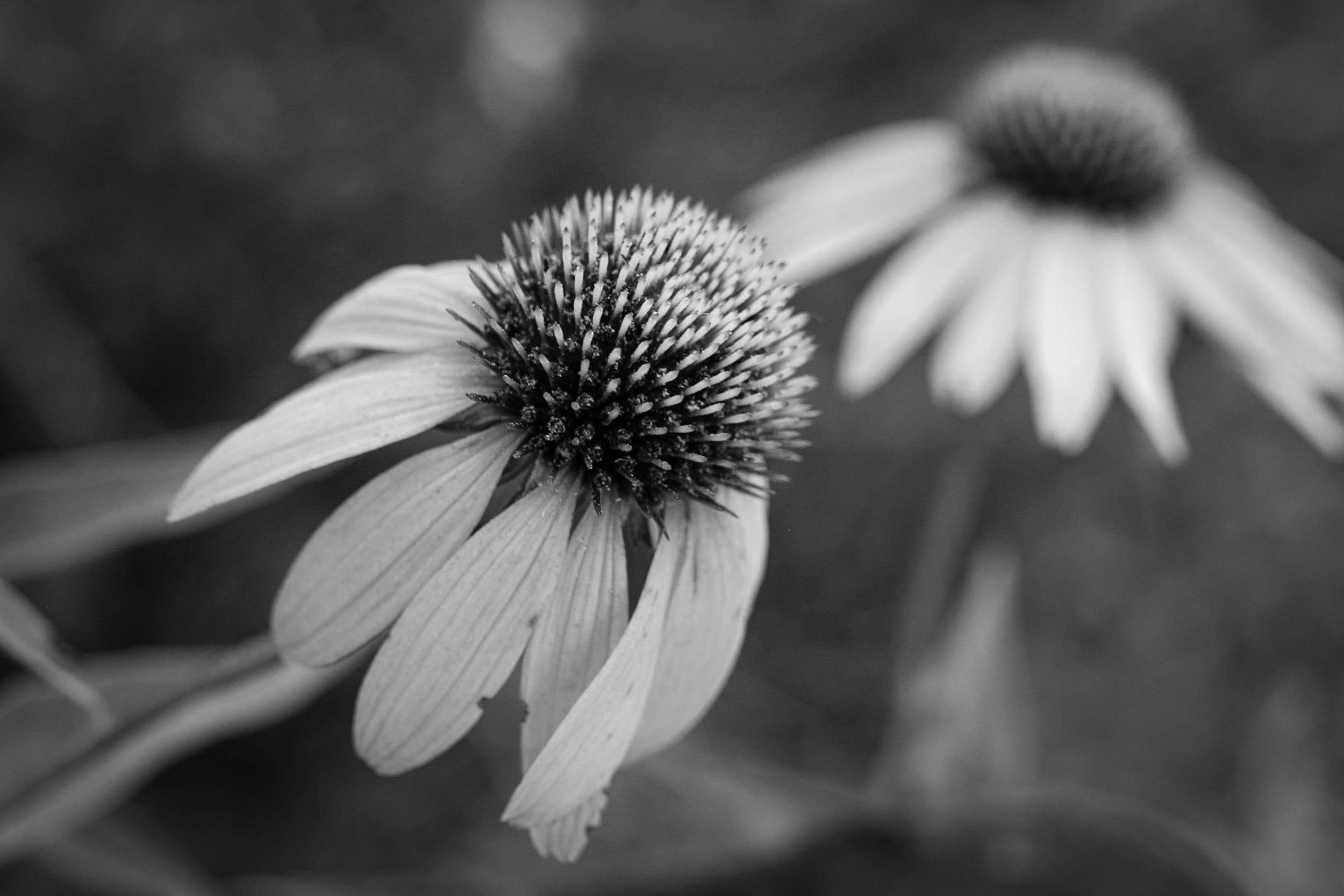
Flowers can be some of the most organic shapes. With soft curves and flowing edges, they are never quite the same twice. But in the following image, with the purple removed from the petals, the attention shifts. It becomes less about color and more about the contrast between the spikey, almost geometric cone at the center and the gentle, organic curves of the petals.
In color, the purple would steal the show. In monochrome, it’s the structure, with the contrast between sharp and soft shapes, that defines the photograph.
The next image of the dancing flames of a campfire provides a pattern that is less recognizable. Without color to provide context, the flames are reduced to curves and lines, more gesture than object.
Not all shapes are fixed or familiar. Some, like fire or moving water, change faster than we can fully take them in. In monochrome, these fleeting shapes are like a frozen memory of something that has already disappeared.

Without color, the shapes in an image carry the weight. They give the image its emotion and tell the story. Shooting in black and white, I hope to train my eye to look more for shapes. Using shapes can help to make stronger images, whether shooting in color or in black and white.
This is just one part of what I hope to learn from my month of monochrome. Next week, I plan to look closer at texture, another way of seeing that can change how a photograph feels.

✅ Where to Find Me
You can find more of my work on the web at: Simmons Photography
If you want to work with me, or inquire about licensing images: Contact Page
Very interesting. I like it
Great stuff, Bob. Really like the first image of the barn, lovely play with shapes there.